BigFix Security Configuration Manager (SCM)
Rethinking how enterprise security admins define compliance baselines, reducing time to create a checklist by 66 percent, and turning a redesign into a template adopted across the product.

How the BigFix console looked before the re-design
BigFix Security Configuration Manager is a critical tool that helps organisations configure compliance checklists for endpoints to meet global standards, including CIS, DISA STIG, FDCC, PCI DSS, and USGCB. The way users interacted with it had not kept up with how they work today. The existing interface was a tab-heavy system built over years of patchwork enhancements, powerful but with no clarity.

What the redesign delivered
The situation
30 to 35 minutes to do what should not take 10
"We are asking too much of our users. 30 to 35 minutes to do what should not even take 10." - Product Manager, first meeting of the redesign initiative
The task in hand
Redesign the Create Checklist workflow
This case study documents the redesign for the Create Checklist workflow, to improve task completion that supports first-time users without compromising flexibility for power users.
The goal was clear: reduce the time to create by at least 30 percent, and make the workflow usable with little to no onboarding friction.
Understanding the user context

This meant that checklist creation was not an isolated task. It was part of a larger compliance workflow where incorrect selections could affect deployment, monitoring, and the organisation’s security posture.
Research approach
My first step was a deep audit of the existing system. To understand user pain, I pulled information from three key sources rather than relying on a single lens.
Support data
Analysed ticket patterns to identify the most frequent failure modes and misunderstood interactions.
Heuristic evaluation
Systematic audit of the existing interface against established usability heuristics with severity scoring.
1:1 sessions
Direct conversations with security admins to understand mental models, workarounds, and frustration points.
Themes Identified
Difficulty Navigating Long Lists
"There are too many items, and I can't find what I need quickly".
- Users struggled to scan, filter, or search through extensive lists of controls/checks.
- Many didn't know category names or CIS codes offhand
Poor Visibility into Checklist Metadata
"I don't know what each check really does without opening another tab"
- Source checklist, category, and severity were either missing or buried.
Lack of Confidence in Selection
"I'm never sure if I've picked the right checks until it's too late."
- Users lacked immediate visibility into what they had selected.
- They feared misconfiguring something that would negatively affect security posture
Unclear Outcomes or System Feedback
"I'm not sure what happens after I hit the 'Create' button"
- Users felt unsure whether checks were copied correctly or if any prerequisites were missing
From research to design focus
The findings from the support data, heuristic evaluation, and administrator sessions pointed to one connected problem: users were being asked to make complex security decisions without enough guidance, context, or feedback.
The Problem statement
Users struggle to confidently create effective checklists due to unclear terminology, lack of contextual guidance, and insufficient validation. This leads to critical errors such as submitting empty checklists, misinterpreting technical jargon, and choosing irrelevant checks without understanding their impact. As a result, users feel uncertain, frustrated, and fearful of making security-compromising mistakes, undermining trust in the product.
Understanding the TO-BE situation
Emotional state shift
From anxious and confused in the AS-IS, to confident and in-control in the TO-BE. The redesign had be both functional and feel safe to use.
Reduced errors proactively
System must prevent common mistakes before they happen like blank names, no checks selected and unclear actions. It should also focus on prevention over recovery.
Lower cognitive load and improve clarity
Terms explained inline, feedback immediate, options transparent. No guessing what L1 means or whether a selection applied.
Time savings
Make large checklists manageable and relevant. The target was a 30 percent reduction in time to create, the result was 66 percent.
Part B: Exploring the solution space
From a 45-minute workshop to three competing ideas
Starting with "How might we help users feel more confident and in control when creating a checklist?" we ran a 45-minute workshop with the product and dev teams on Mural. Multiple raw ideas emerged. The most voted moved to a second round of brainstorming and technical feasibility assessment.
Loved, but too many unknowns

An ambitious concept that the team responded to strongly, but when assessed for technical feasibility it ventured into territory with too many open questions to move forward confidently.
Did not proceedSafe, but we can do better

A more conservative approach that would have worked and was buildable, but did not address the root cognitive load issue. It improved the surface without changing the model.
DeprioritisedLooks ideal, users will tell us
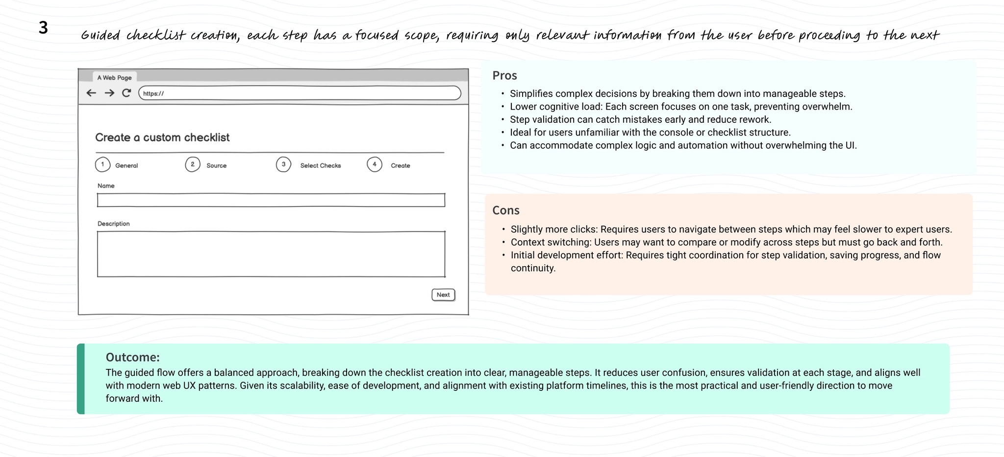
A stepwise, guided flow that broke the overwhelming table into sequential decisions. The most promising approach on paper. Moved to user validation.
Validated and shippedUser validation
Task based approach used to see how users interacted with the prototype. 7 participants were involved.
The key design decision
Insights helped us move from table to steps
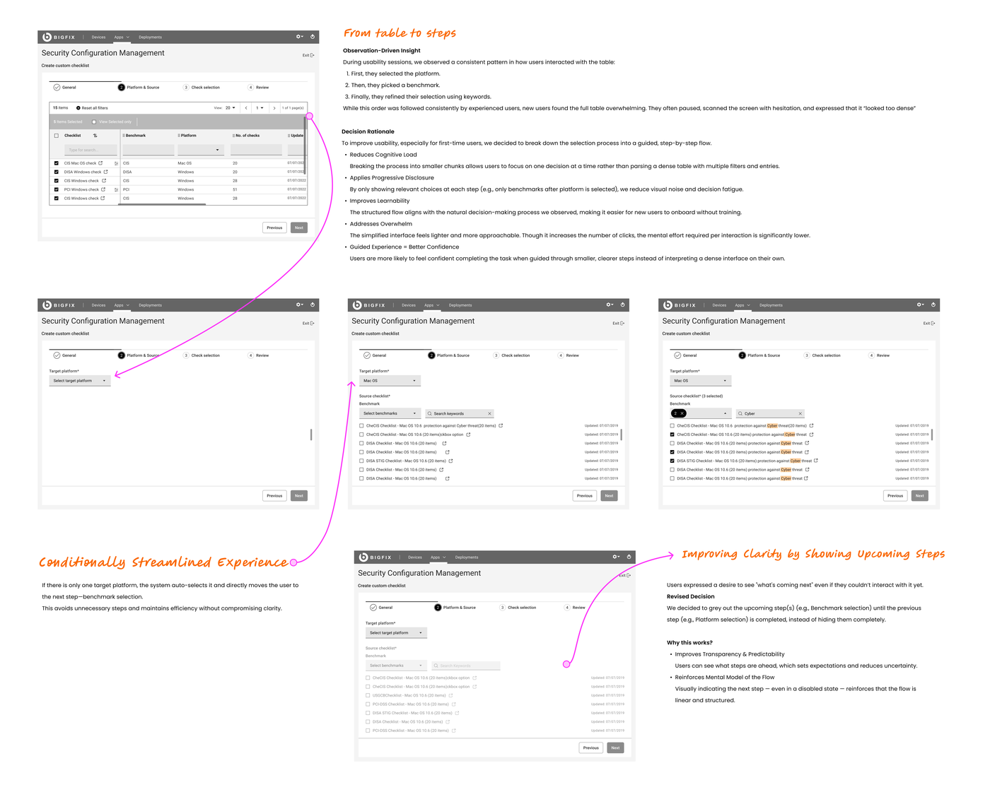
During usability sessions, we observed a consistent pattern in how users interacted with the original table interface: first they selected the platform, then they picked a benchmark, then they refined using keywords. This order was followed consistently by experienced users. New users, however, found the full table overwhelming. They paused, scanned the screen with hesitation, and described it as "looking too dense."
That observation became the core design decision: break the selection process into a guided, step-by-step flow that mirrors the mental model users already had, making it learnable for new users without slowing down experienced ones.
Reduces cognitive load
Breaking the process into smaller chunks allows users to focus on one decision at a time rather than parsing a dense table with multiple filters and entries simultaneously.
Applies progressive disclosure
By only showing relevant choices at each step (only benchmarks after platform is selected), visual noise and decision fatigue are reduced significantly.
Improves learnability
The structured flow aligns with the natural decision-making process observed, making it easier for new users to onboard without training.
Addresses overwhelm without losing power
Though it increases the number of clicks, the mental effort required per interaction is significantly lower. The tradeoff was validated with users before committing to it.
Annotated design decisions below, showing the original table, the three progressive step states, and two specific micro-decisions surfaced during iteration. Modified per NDA.
Conditionally streamlined experience
If there is only one target platform, the system auto-selects it and moves the user directly to the next step. This avoids unnecessary steps and maintains efficiency without compromising clarity.
Improving clarity by showing upcoming steps
Users expressed a desire to see what is coming next even if they could not interact with it yet. Upcoming steps are greyed out rather than hidden entirely, improving transparency and reinforcing the mental model of the flow.
The final design
Users needed just 4 steps now
The redesigned workflow breaks a previously overwhelming single-screen table into four sequential steps: General, Target Platforms and Source Checklist, Check Selection, and Review. Each step shows only what is needed at that moment, with validation, tooltips, and feedback built in at the point they are needed.
Step 1 of 4: Name and describe the checklist
Directly addresses the catastrophic heuristic failure: checklist creation previously allowed without a name. This step enforces validation before the user can proceed.
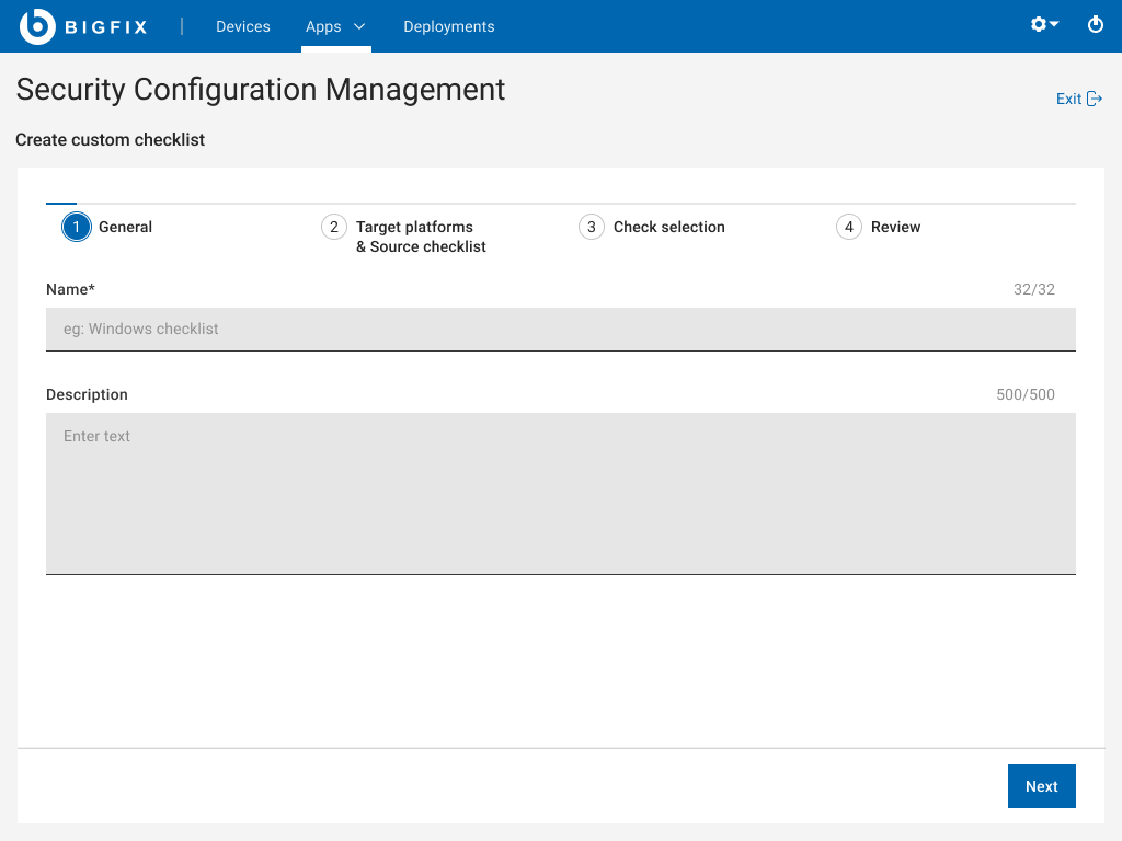
Default, empty state with character counts visible

Error state: inline validation, cannot proceed without a name
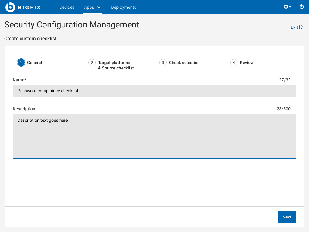
Filled state: character count updates live, Next enabled
Step 2 of 4: Target platforms and source checklist
The observation that users naturally selected platform first, then benchmark, then refined by keyword is encoded directly into the step structure. Progressive disclosure: benchmark list only appears after platform is selected.

Platform dropdown with benchmark list shown contextually

Tooltip providing inline context, no separate help page needed

Benchmark selected, relevant checklists populated below
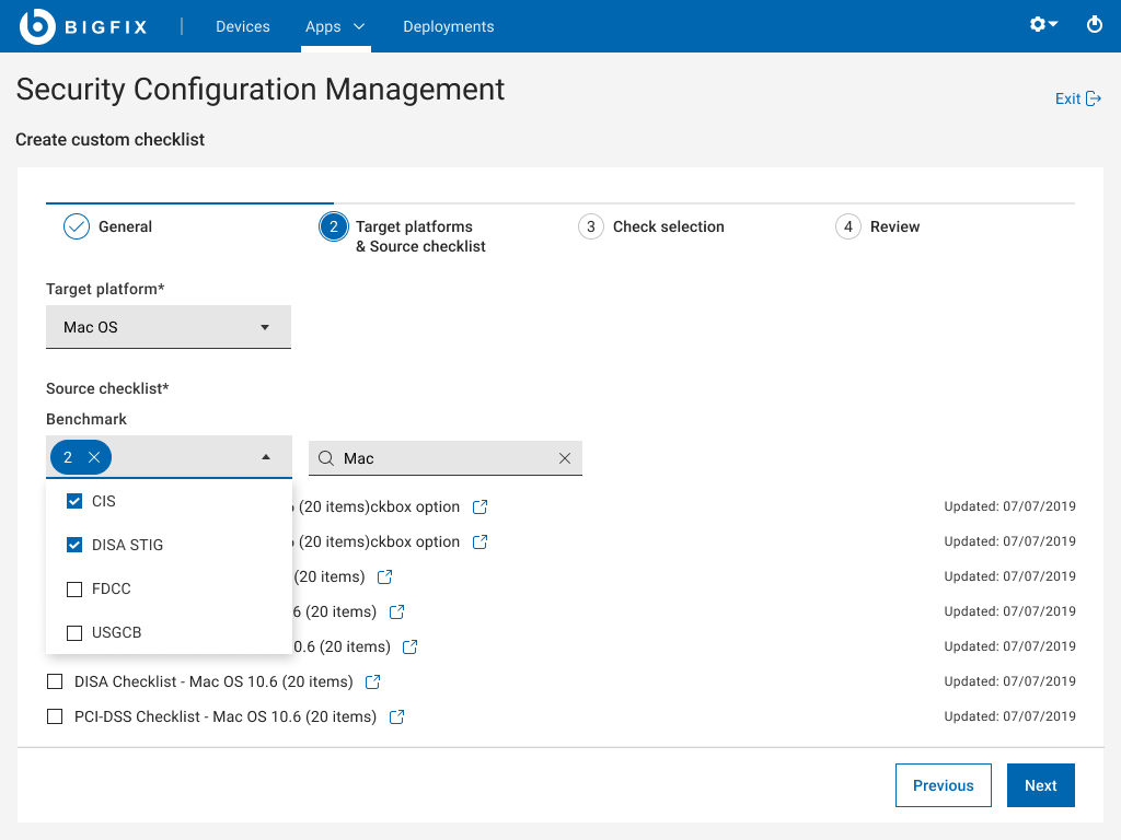
Keyword search active, list filtered to matching results
Step 3 of 4: Check selection
Previously one of the highest-friction steps, users could not filter by severity or category and had no descriptions to assess relevance. Now shows source checklist, source ID, category, and severity in columns, with search and filtering available.
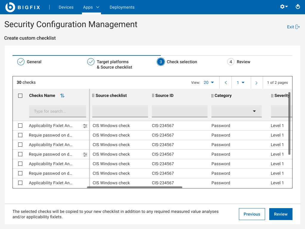
Check selection with all columns visible and search available

Checks selected, active state clear, Review button enabled
Step 4 of 4: Review and create
A full summary of everything selected before committing, addressing the "I do not know what I am about to create" anxiety. The progress confirmation closes the loop, telling the user exactly what happens next and where to find the checklist.

Full summary before committing, all selections visible

Error state on review, prevents creating an invalid checklist
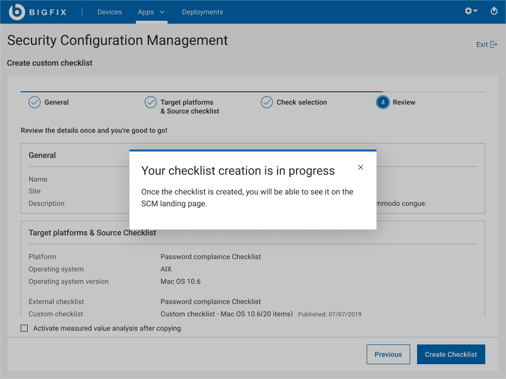
Creation in progress, user told exactly where to find the result
Accessibility & inclusive design guidelines
- Clear, descriptive labels for actions and inputs, avoiding jargon-only controls or cryptic IDs.
- Predictable focus and navigation order across steps, supporting keyboard use and reducing disorientation.
- Inline help and definitions for technical terms to lower cognitive load and support users with different levels of expertise.
- Specific, visible error messages placed near the relevant fields, explaining what went wrong and how to resolve it.
The visual foundations of accessibility (contrast, type scales, focus styles, and component behaviour) were already provided by the product’s design system. My focus in this project was on making the workflow itself accessible by reducing cognitive load, clarifying terminology, and UI feedback.
Challenges and constraints
Validating with domain experts at scale
In a B2B security tool context, the user base consists of domain experts, which makes it challenging to conduct usability testing at scale or gather broad feedback quickly. I relied on qualitative feedback, shadowing sessions, and rapid prototypes to validate concepts and reduce guesswork.
Designing for edge cases and flexibility
Checklists can have overlapping checks, exceptions, and platform dependencies. Handling exclusions, duplicates, and user modifications while maintaining UX clarity is complex, especially when multiple tabs or bulk actions are involved.
Working within legacy technical constraints
Shifting from a desktop console to a web UI meant navigating backend limitations, ensuring backward compatibility, and designing incrementally without promising automation or feedback patterns that were not technically feasible yet.
Three things that made this work meaningful
Cross-functional collaboration
Working closely with engineering, product, sales, support, and Tech Advisors to balance backend constraints with UX goals was my favourite part of this project. Great systems are co-created, not handed off.
Solving for genuine complexity
Simplifying a highly technical domain and turning complex workflows into clear, guided experiences was genuinely satisfying. Every design decision had a direct impact on reducing errors and increasing user confidence in a security-critical environment.
Meaningful impact through micro-improvements
Small changes, like improving terminology, feedback messages, and flow structure, delivered measurable improvements in clarity and workflow efficiency. This project reinforced that detail-level design decisions compound into real organisational outcomes.