HCL BigFix Workspace+
HCL BigFix helps organisations manage and secure employee devices at scale. Its Self Service Assistant, or SSA, allowed employees to access software, complete device actions, and respond to compliance requirements. The product was evolving beyond endpoint protection. The long-term vision was for SSA to become part of HCL BigFix Workspace+ which was to become an AI-driven platform for workspace management and digital employee experience that boosts productivity, secures endpoints, and supports hybrid enterprises. The challenge was to improve the existing experience while laying the foundations for this broader digital employee experience. The Product was being used across 47 countries and managing more than 140 million endpoints.

What changed
The challenge
From a technical tool to an employee-facing experience
"We are not just protecting endpoints anymore, we are expanding to transform the entire employee experience. Our 560 plus enterprise clients need BigFix to be both their security shield and their productivity enabler. I need you to take a deep look at our existing SSA and figure out how we can evolve it into the bridge that makes this dual mission possible." - PM, SSA BigFix
And with this, the work began.
The task in hand
Building the bridge
My role was to evolve SSA into the bridge between security and productivity, ensuring it could deliver both protection and a seamless digital workday for employees.The existing SSA was primarily understood as a software catalogue and compliance tool. It supported application downloads and admin-driven compliance notifications, but the experience had several usability and workflow problems.
The action plan
A long term plan, with short term wins
The first step was identifying a plan, with Workspace+ as the ultimate long term goal, and a short term goal of improving experience for existing and new SSA customers.
Develop context
Understand the current product and the wider employee ecosystem.
Start small
Identifying and picking the smallest problem to solve to improve the current employee experience
Setting foundations
Defining use case for applying NLP, identifying edge cases
AI integration
Finally realising the AI-DEX
Developing context
Understanding AS-IS and TO-BE
Understanding the current state of the business with stakeholders, and conducting an internal UX audit of the existing system, helped map where SSA stood,how it fitted into the wider BigFix ecosystem and where it needed to go.
| Category | AS-IS | TO-BE |
|---|---|---|
| Position and perception | Seen only as a basic catalog tool for app downloads, limited to compliance use, no clear workspace alignment | Evolve into the core employee interface in Workspace+, central to the digital workday experience |
| User experience | Heuristic gaps, jargon heavy, technical glitches, no adoption data, a backend driven admin tool | A seamless, intuitive self service hub with clear language and guided actions |
| Market and competitor view | No clear competitive positioning | Position as a partner ecosystem player alongside Zendesk, Jira, and ServiceNow, differentiated by BigFix's IT and security strengths |
The current state
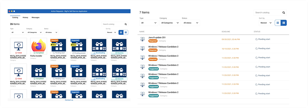
This is how the current version of the app looked before the redesign. Few things were visible upfront, and the user interactions confirmed all our assumptions.
This case study has two parts

The research
We conducted 5+ 1-1 interviews with existing SSA users who had been using the application for some time. We explored how they completed common tasks, understood different types of requests, and navigated the existing experience. Synthesising the interviews revealed four recurring themes.
Jess represents the type of existing SSA user we spoke to during this research.
Information overload & lost control
Cognitive load from mixed navigation patterns, non-default preferred view, notification clutter, users can't get to what matters without fighting the interface.
Conflated intent (offers vs. action requests)
Two different action types with different urgency/intent presented identically
Missing efficiency affordances
No bulk select on action requests, no reinstall path leading to friction in repeatable workflows
Visual trust deficit
Dated UI + confusing wizard copy undermines confidence even when functionality is fine.
The Identified Problem
The current interface presents users with a high cognitive load due to a cluttered layout, oversized icons, and an overwhelming amount of information. Users struggle to differentiate between offers and action requests, as they are visually presented together, leading to confusion. The overall UI lacks refinement and aesthetic consistency, reducing user confidence in the system. Additionally, preferred views like the list view, which users find cleaner and more intuitive, are not set as the default, further complicating navigation. The combination of tabs and dropdown filters creates unnecessary complexity and adds to user frustration. Furthermore, users are unable to perform grouped actions on multiple requests simultaneously, limiting efficiency and adding to their workload.
How decisions were prioritised
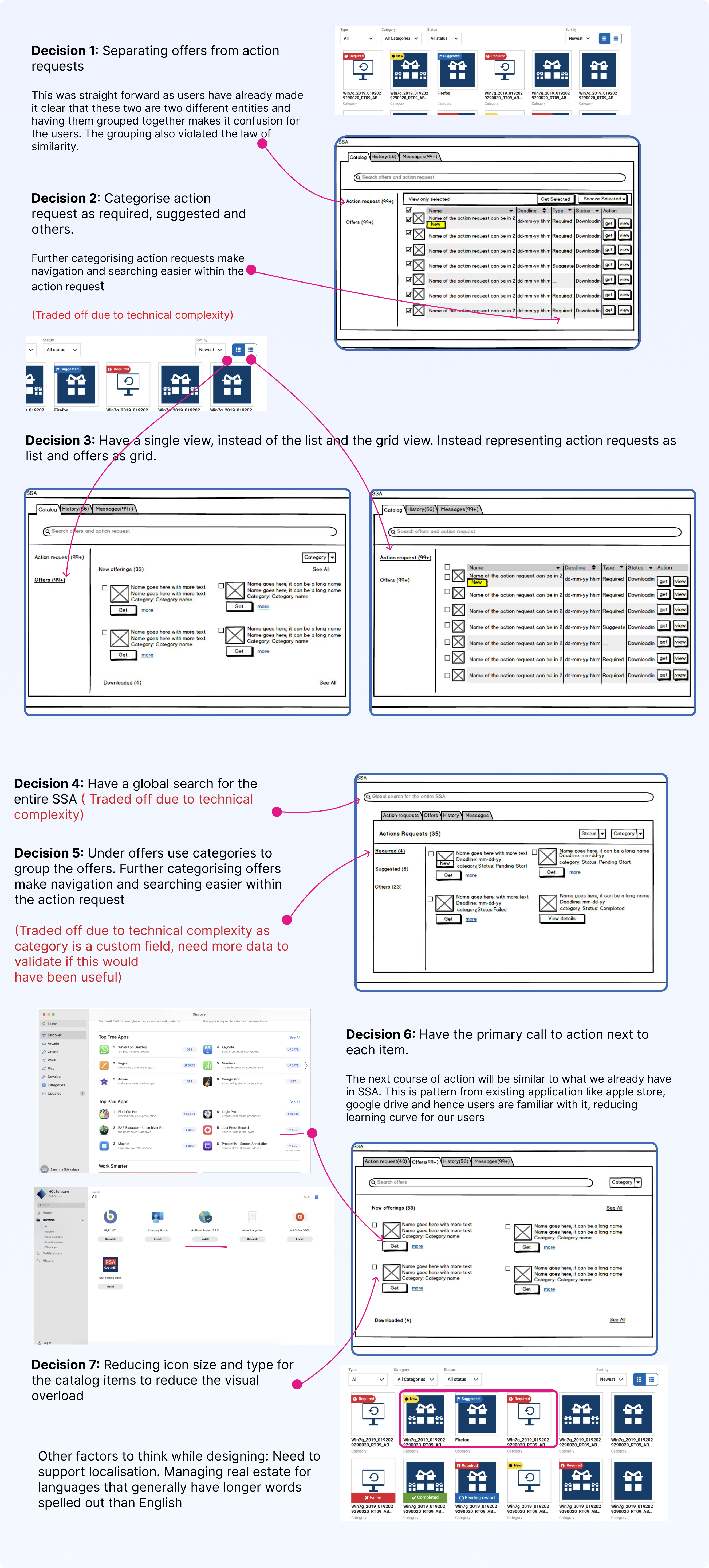
We prioritised changes that directly addressed the usability issues identified in research and could be supported by the existing product architecture. Ideas that required larger backend changes or additional validation were documented as future opportunities rather than included in the immediate redesign.
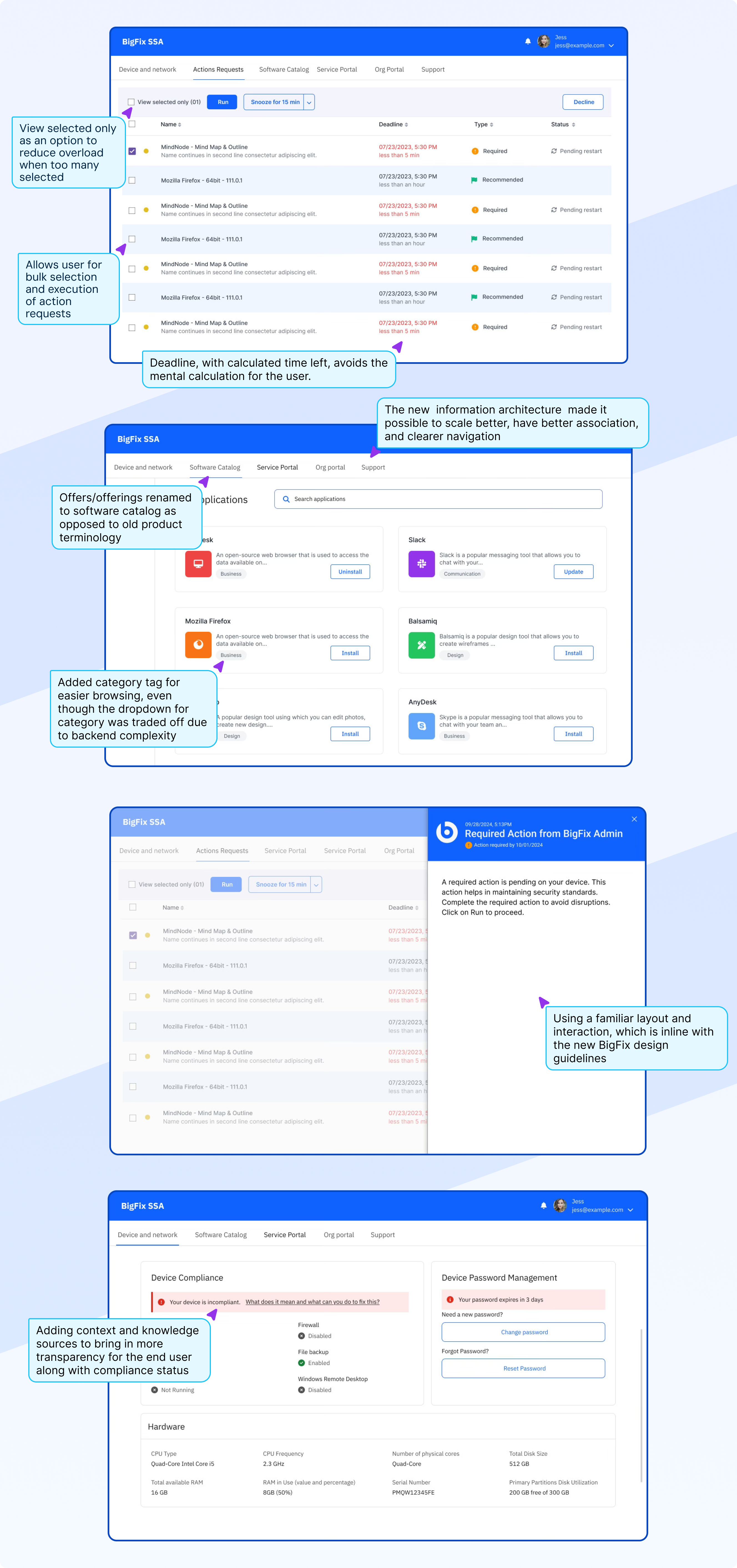
The redesign focused on
Brainstorming & re-defining the experience
Visual design and micro-decisions

Because this work was intended to establish the foundations for DEX, the team agreed that raising a service ticket was the most valuable use case to explore. The goal was to create an experience that helped users resolve their issues quickly, with minimal time and effort spent in the application.
What research found
We spoke to the employees within org and partner orgs who have recently raised a service ticket and the real opportunity for our usecase is to move from a form-filling model to an assisted problem-reporting model
The current process is designed around the organisation’s service structure, but employees experience problems as real-world tasks that have stopped working.

The hypothesis
If employees are given a plain-language, guided reporting experience that automatically captures relevant context and routes the issue to the correct team, then they will submit tickets with less effort, provide more complete information, and experience fewer routing delays and follow-up requests.
Hypothesis can be measured by
Time taken to submit a ticket
Percentage of tickets routed to the correct team initially
Ticket abandonment rate
Percentage of tickets requiring clarification
Defining the information architecture
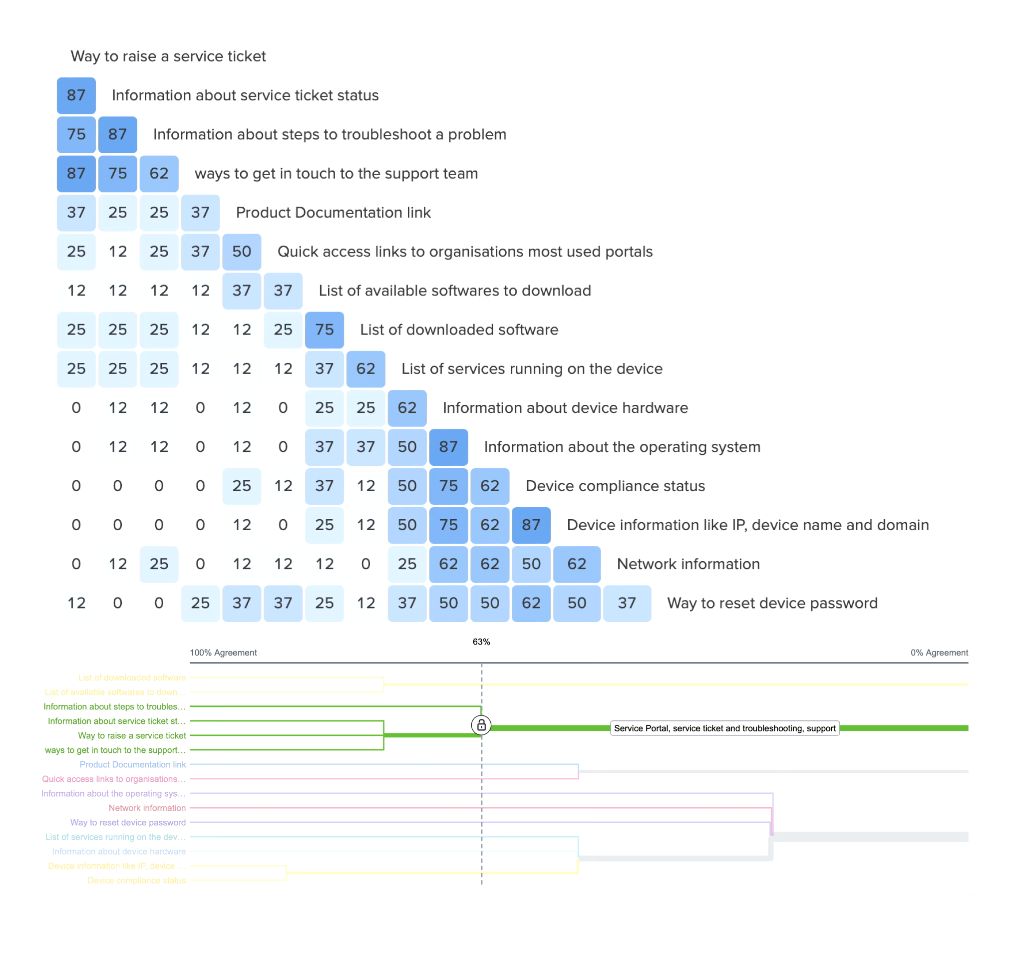
We referred to content from existing applications and conducted open card sorts to understand how users group content. This informed the information architecture and allowed us to create categories that matched our users’ mental models.
Brainstorming ideas & wireframing

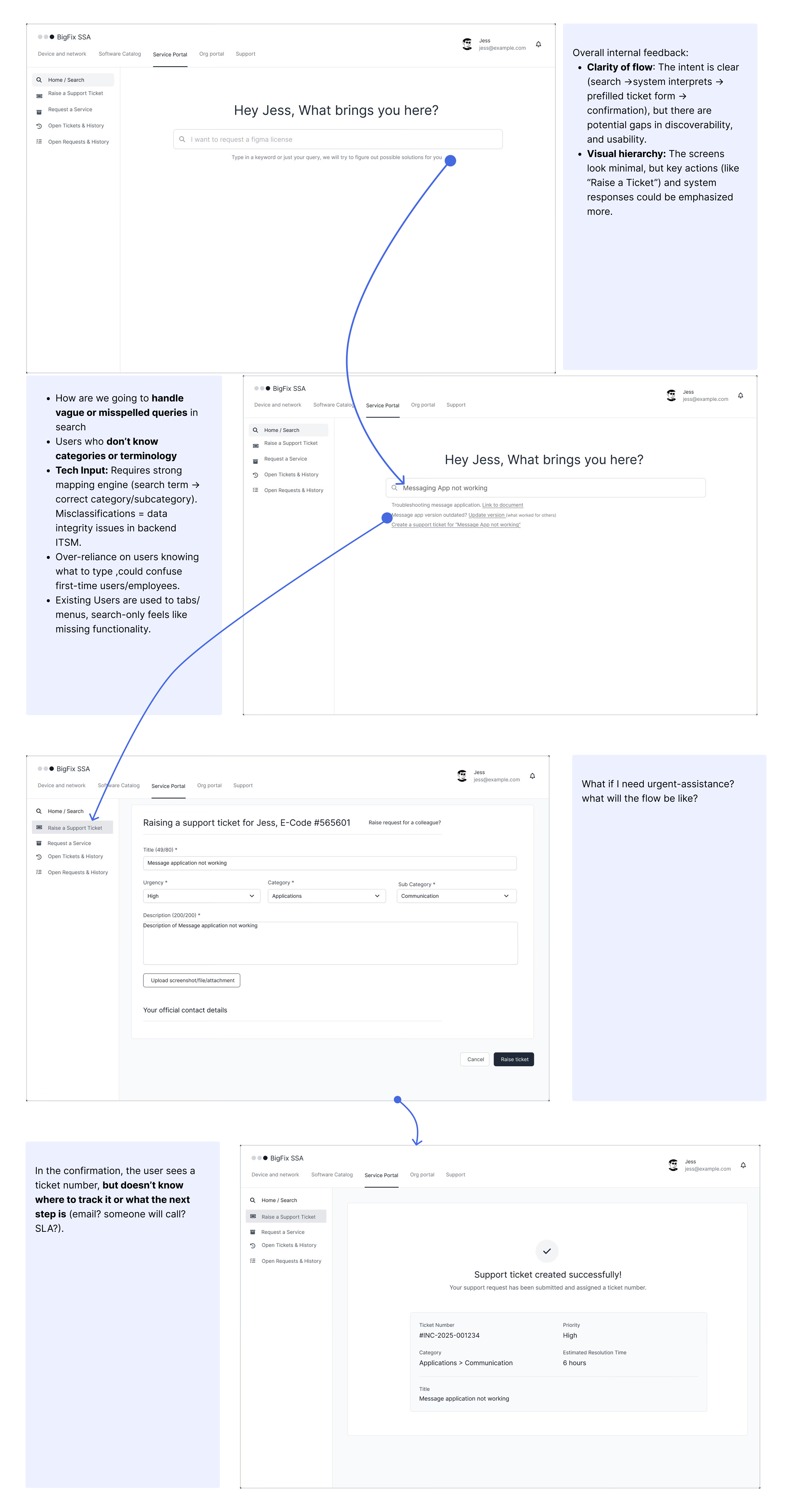
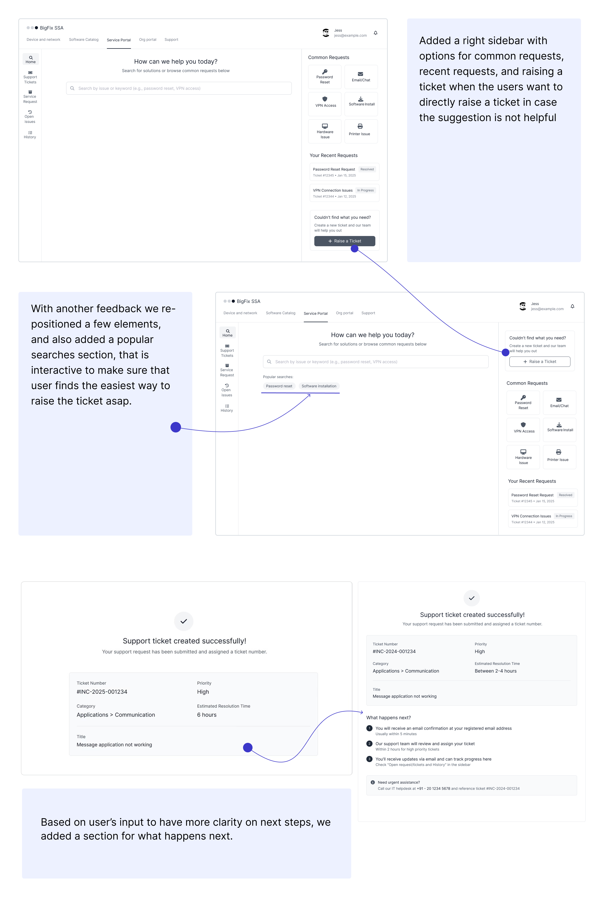
I used usability sessions to evaluate whether users could find the right starting point, describe their issue in plain language, review the pre-filled information, and understand what would happen after submitting a ticket. Feedback from these sessions informed the placement of common requests, the popular-searches section, the pre-filled form, and the “what happens next” content.
Where the happy path breaks
Will users always follow the ideal flow?
No. Real edge cases the design needed to account for:

The visual design
I created these screens working within the existing BigFix and HCL Software design system. The system provided the component library and visual language. My contribution was applying it to the new information architecture and interaction patterns, ensuring every significant design decision traced back to something a user had told us.
Screen 01
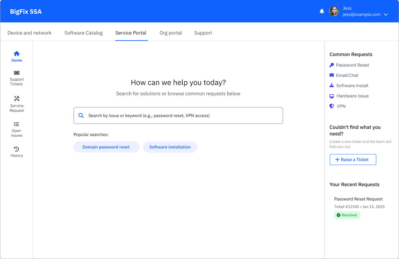
Service Portal Home
"I rely on IT for a lot of basic things. I have to raise a request every 45 days to reset my password, and I do not know which category to use. I have bookmarked it for myself."
Keyword search with popular suggestions
Users did not know category names. Rather than forcing them to browse a taxonomy, the search bar accepts natural language and surfaces the most common requests as chips below it. Reduces the cognitive effort of finding the starting point.
Common requests sidebar, always visible
Password reset, email and chat, software install, hardware issue and VPN are the five most frequent requests. Surfacing them persistently in the sidebar removes the need to search at all for the majority of use cases.
Recent requests with status visible
Directly responds to "I do not always know where my ticket stands." The user can see their most recent ticket and its resolved or open status without navigating anywhere.
Screen 02
Pre-filled forms
Form-filling was one of the most tedious task in the whole process

Time taken to fill ticket details dropped
User has become a reviewer instead of the one responsible for creating the ticket reducing cognitive load and human errors
Screen 03
Ticket Creation Success
"I do not always know where my ticket stands." "No clear timeline." "I have to follow up for updates."

Ticket summary with accurate classification
Ticket number, priority, category, and estimated resolution time are shown immediately on the success screen. More accurate classification at this point was the direct driver of the 10 to 15 percent MTTR reduction, faster triage happens because the ticket arrives correctly categorised.
What happens next, numbered and time-bound
Three clear steps with time expectations: email confirmation within 5 minutes, team review within 2 hours for high priority, and where to track progress. Eliminates the follow-up support request that was previously the only way users could get this information.
Urgent assistance callout for critical cases
A contextual panel appears on high priority tickets directing users to the urgent support line. Keeps critical cases from being stuck in standard ticket queues.
The handover
What I learned
Efficiency is more than speed
Usability testing showed that cutting down minutes was not just about fewer clicks, but about clarity in navigation, separation of actions and offers, and giving users confidence they were on the right track.
Short term fixes must align with long term vision
Balancing immediate improvements for existing SSA users with Workspace+'s long term roadmap taught me to design incrementally without losing sight of the bigger picture.