SaaS user onboarding
Design was tasked with designing user onboarding for an enterprise product transitioning to a SaaS model. My colleague and I co-led the research to design an onboarding process that would enable users to onboard efficiently and realise value quickly. Given the product's enterprise security focus, a clear, concise, and effective onboarding was critical. The goal was to create a scalable solution that future designers could reference, ensuring consistency and effectiveness as the product evolved. We worked within the Enterprise Design Thinking framework, which emphasises end-user outcomes, relentless reinvention, and minimising risk.
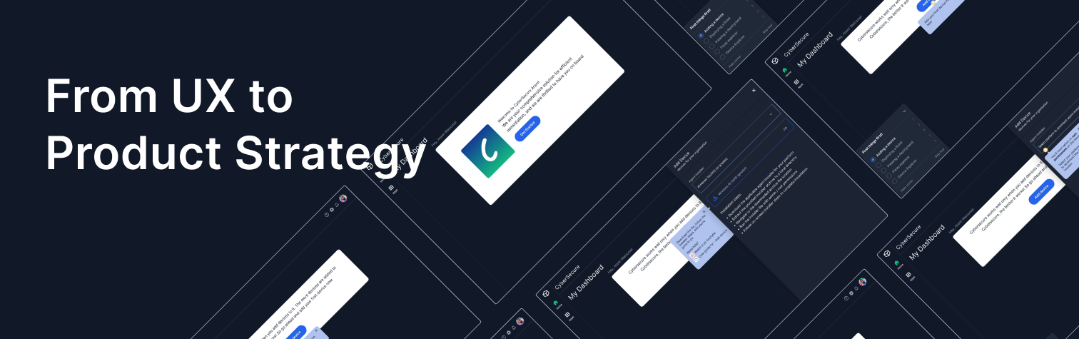
The Outcome
01
Task-based, role-driven onboarding designed and handed off, resulting in faster value realisation for our users.
Tested with alpha & beta users
02
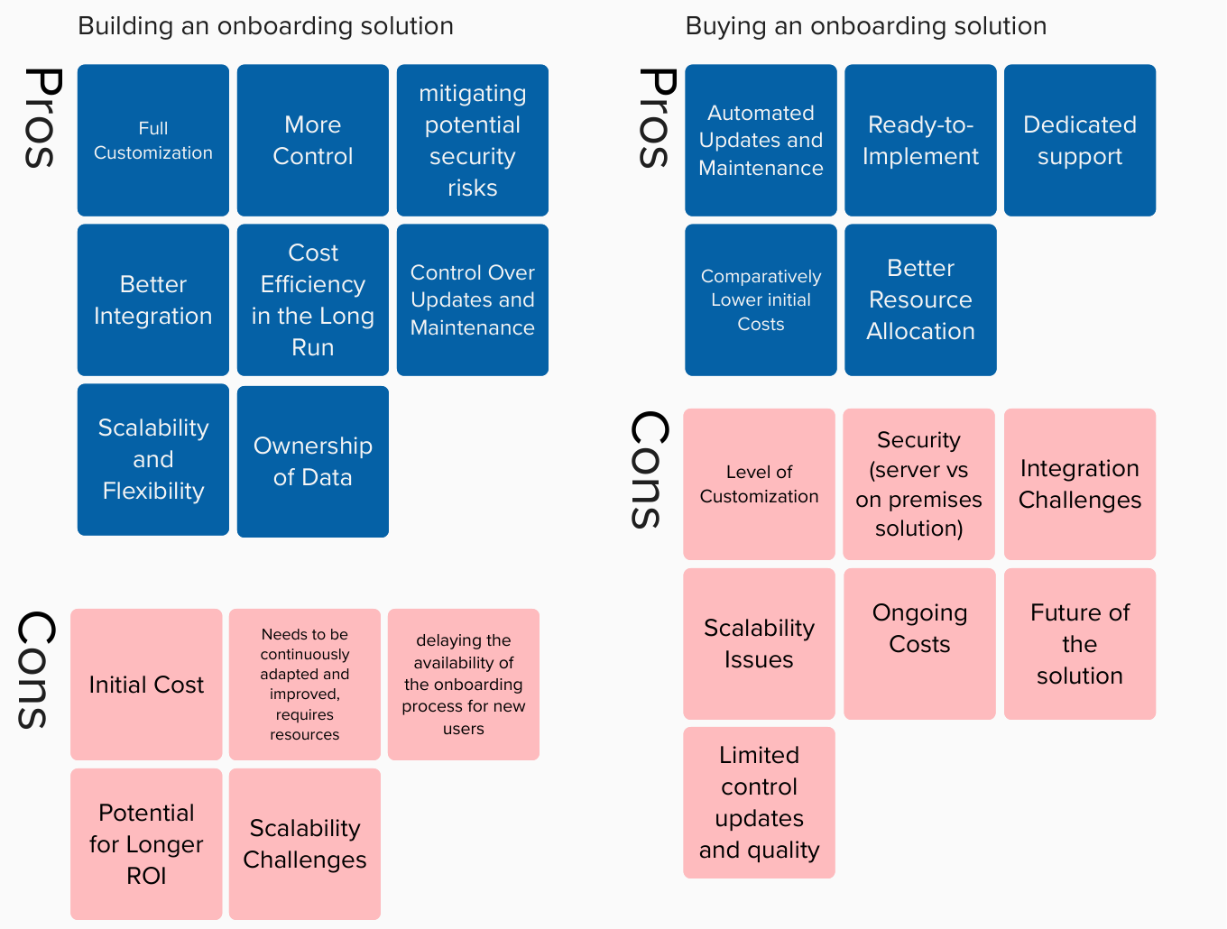
Led the build versus buy discussion with stakeholders, with pros and cons & open questions for decision making
Decision: Initial Build, Eventual Buy
03
KPI defined and agreed with stakeholders to measure success of onboarding & design
04
Design requirement for third party solution defined and shared
Before we moved forward we needed to answer this.
Does a well-designed product need onboarding? Does good UX reduce the need for onboarding?
A common assumption in product teams, and one that rarely holds true in B2B SaaS. Our product was clean, logically structured, and tested for usability. Yet users still struggled to discover high impact features that differentiated the product. Intuitive interfaces do not automatically communicate where to start, what matters most right now, or how success should look in the first session. Good onboarding accelerates confidence, direction, and value realisation.
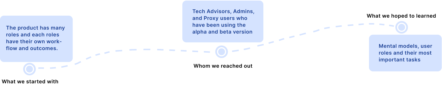
The First Action - Research
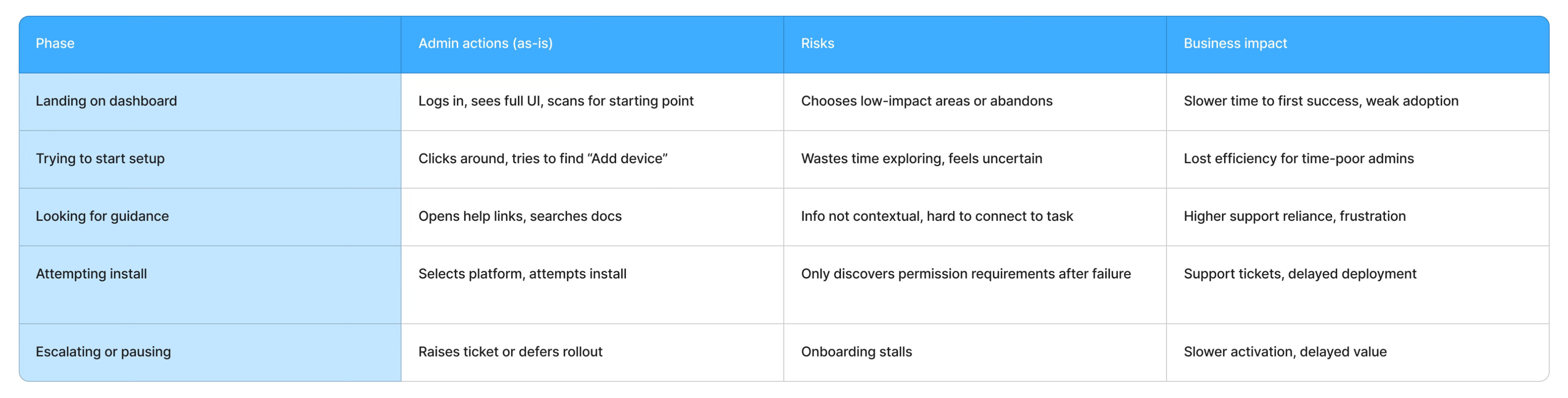
Admin onboarding journey (as-is) - Condensed
From interviews and observations with Admins using the alpha/beta, we reconstructed their current onboarding journey as three layers: what they do, what can go wrong, and what that means for the business.
What did we learn?
Volume without prioritisation leaves users more lost than before they started.

Having resources is not the same as having direction.

Users also pointed out feature invisibility and no clear entry point
The onboarding needs to be tied to the role to make it more effective
By focusing on high-frequency, high-impact issues that directly affected completion of the core tasks across our 8 participants (3 Admins, 4 Tech Advisors, 1 Proxy user), we ensured that design effort was tied to measurable business outcomes.
Next, team alignment, shared vision and KPIs
Getting back to all the stakeholders with the findings, and making sure the entire team was aligned, was critical. It set the tone for all the work ahead. The stakeholder views shaped the design direction.
Reduce cognitive load
By presenting information progressively and contextually, prevent users from feeling overwhelmed and ensure they can easily retain key details. We deliberately avoided gamified progress meters and playful celebrations, even though they’re common in SaaS onboarding. In an enterprise security context, Admins valued clarity and reliability over ‘delight’. Extra visual noise would have competed with critical information and increased cognitive load.
Personalised, role-based journey
Through customised onboarding paths based on user roles and needs, make the onboarding experience relevant and engaging, helping users find value faster. Personalisation here was pragmatic, not decorative. We chose role-based paths over individual-level behavioural personalisation, because the organisational role (Admin, Deployment specialist, Super Admin) mattered far more than personal preferences, and deeper personalisation would have added complexity without clear enterprise value.
Offer continuous support
Provide contextual help, tooltips, and access to comprehensive resources at every step, reducing frustration and promoting a smoother learning curve.
Interactive learning
Interactive tutorials and hands-on activities allow users to gain practical knowledge and confidence in using the application from day one.
KPIs defined with stakeholders
When design became product strategy
As we documented our research findings, a question surfaced: can this system scale with this product over time? This was where the work stopped being purely UX-led and became deeply product-driven. As a designer, this was a turning point. I was not just advocating for usability, I was researching factors that could influence product strategy.
Should onboarding be built in-house or supported by a third party solution? The questions we asked of stakeholders were not design questions. They were product and engineering questions.
Questions put to stakeholders
Is onboarding a core differentiator or an enabling capability?
Could relying on a third party compromise our competitive edge or control?
How frequently will onboarding need to change as the product evolves?
Can a third-party solution meet our specific technical and security requirements?
What is the long-term cost of maintaining this internally versus buying?
How will this scale across roles, features, and customer segments over three to five years?
Build now, buy later
We chose a phased approach: build a lightweight, purpose-built onboarding experience to support the initial SaaS release, then transition to a third-party onboarding platform as complexity and scale increased.
This decision balanced speed with sustainability. It allowed us to stay close to user needs early on, avoid premature optimisation, and prevent long-term design and engineering debt. Importantly, when we would eventually buy a solution, we would have a clear, informed view of exactly what was needed, based on having lived with the problem first.
Short term: build
A lightweight, purpose-built onboarding experience for the initial SaaS release. Fast to ship, close to user needs, avoids premature optimisation.
Long term: buy
Transition to a third-party onboarding platform as complexity and scale increase. Quick implementation for new features, continuous vendor improvements, reduced internal resource demands.
Back to build: HMW help users reach faster value realisation so that it drives maximum adoption
Walk new users through setup with guidance built for them.
Highlight the actions that move users from sign-up to success.
Catch users when they get stuck, pause, or skip a step. Match the experience to the moment a user needs it most.
Run focused campaigns to move customers from one workflow into the next.
Surface advanced features when patterns show a user is ready for more.
Brainstorming & Iterations
The outcome of the brainstorming and feedback was that we choose task-based/checklist style onboarding. Traditional linear walkthroughs and feature tours felt insufficient. Users came in with specific responsibilities and limited time. They needed momentum, not orientation.
We chose a persistent checklist instead of a guided wizard because Admins needed to see the full path and move flexibly between tasks. A wizard would have increased perceived rigidity and reduced trust, whereas the checklist balanced orientation with control.

Bringing it together
Hotspots
Used to focus and shift user attention. Guide users through steps to complete a task. Once the user interacts, the hotspot disappears. Size: 24 by 24.
Popovers
Accompanied along with hotspots to give user details about steps and CTAs. Provides additional information beyond just asking the user to interact with a component.
Checklist (open)
For the list of user flows covered in the onboarding tour. Visible and interactive while the tour is in progress.
Modals
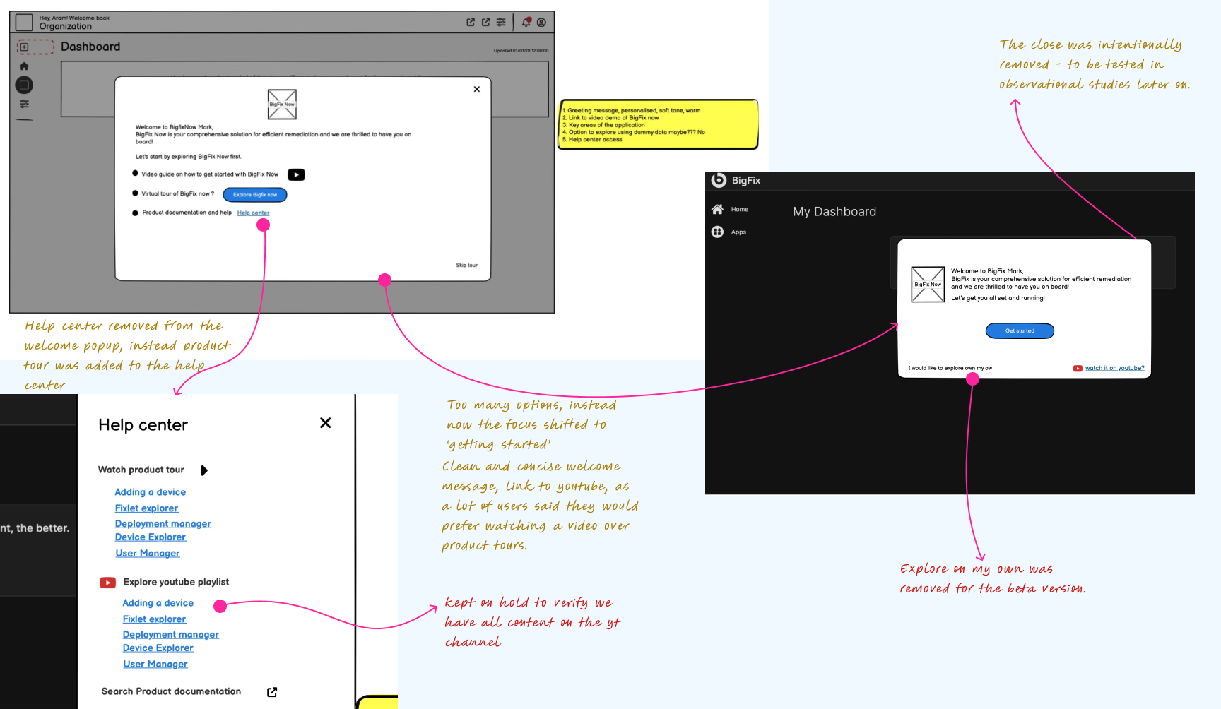
Used for the welcome message at the start of the onboarding journey. Sets the tone and gives users a clear starting point.
Four rules for onboarding elements
Match element weight to interruption cost
Modals block everything else, so they are reserved for the single welcome moment where full attention is warranted. Hotspots and popovers guide without interrupting. Checklists persist but stay collapsible. The heavier the element, the higher the bar for using it.
Evidenced by: modal used only once, at entry; hotspots used in-flow for all subsequent guidance
Surface help at the point of potential failure, not at the start
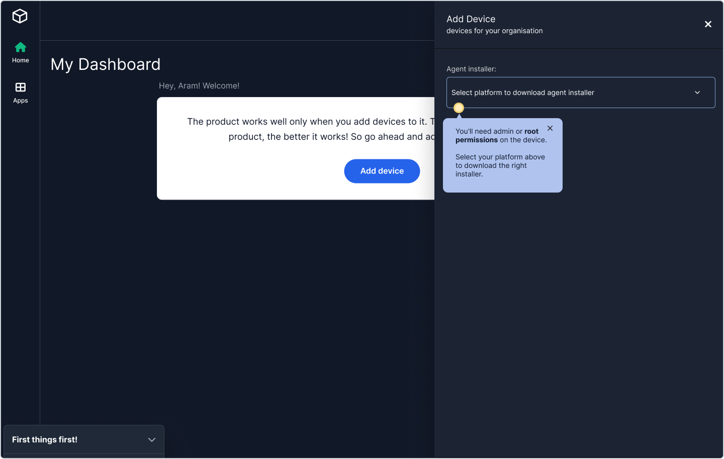
Research showed that front-loaded help overwhelmed users and was quickly forgotten. The permissions warning does not appear on the welcome screen, it appears on the platform dropdown, exactly when the user is about to make a decision that requires that knowledge. Help belongs at the decision point.
Evidenced by: "there are links to help articles but I need to know where to begin" - the research finding that directly shaped this rule
Show the full journey but constrain action to one step
The checklist makes all five tasks visible from the start, so users feel oriented and can see the path ahead. But only one task is active and highlighted at any moment. This resolves the tension between giving users confidence in the overall journey and preventing them from feeling overwhelmed by what remains.
Evidenced by: checklist design showing all tasks visible but only the first one actionable
Support resources should follow user readiness, not appear by default
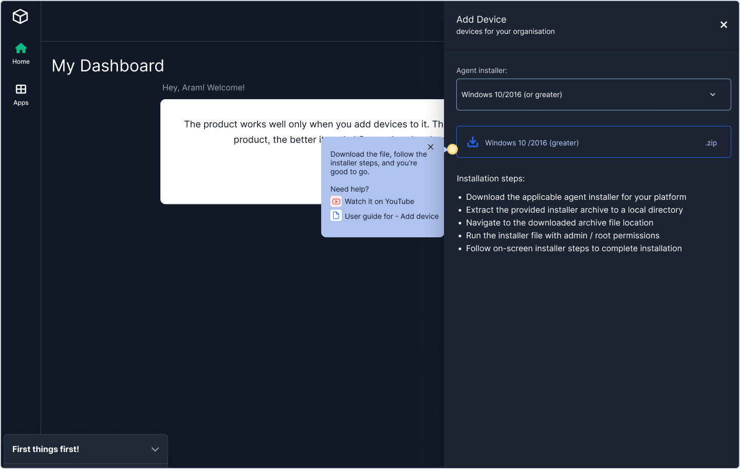
The YouTube link and user guide only surface at step four, after the user has selected a platform and is ready to act on the download. Earlier in the flow they would be noise competing for attention. A resource that appears before a user needs it is not helpful, it is clutter.
Evidenced by: YouTube and user guide links absent from steps one to three, present only at the download step
These rules also explain what we chose not to do. We avoided recurring modals, gamified tooltips, and persistent badges, even though they can increase short-term engagement, because they would raise interruption costs for time-poor Admins and dilute attention at critical decision points.
User journey map for admin onboarding - Condensed
From interviews and observations with Admins using the alpha/beta, we reconstructed their current onboarding journey as three layers: what they do, what can go wrong, and what that means for the business.

The onboarding journey, step by step

Step 1 of 4
Personalised welcome modal
The user lands on the dashboard and sees a personalised welcome rather than the full product interface. One clear action: Get Started. Nothing else competes for attention.
Reduces time to value by: eliminating the "where do I even begin?" moment that was the most common complaint in research.
Step 2 of 4
Checklist and hotspot: direction without a wall of text
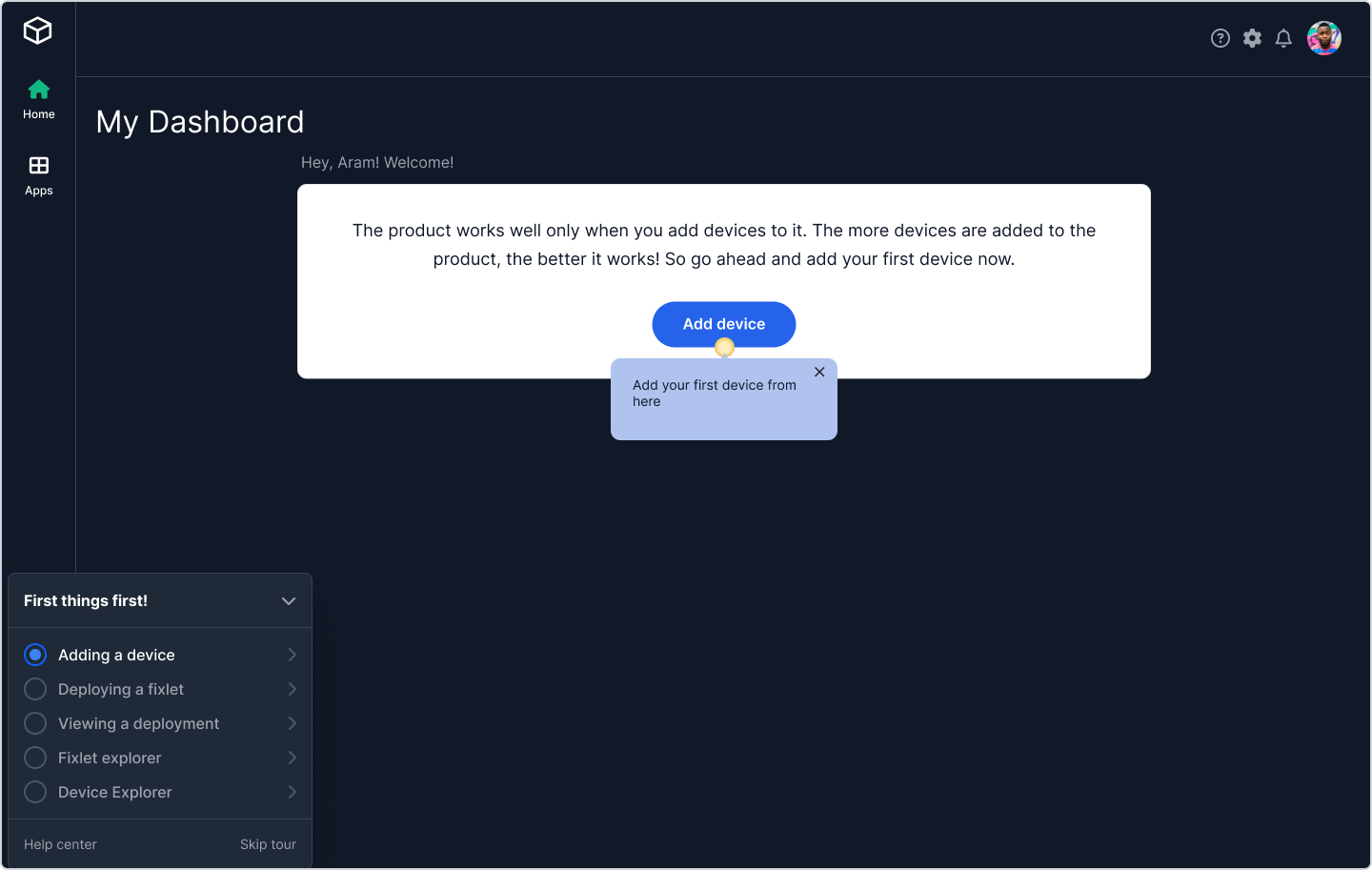
The "First things first" checklist shows the five key tasks in sequence. The active task (Adding a device) is highlighted, and a hotspot on the Add device button with a popover tells the user exactly where to click. The user does not need to explore.
Reduces time to value by: giving users momentum instead of orientation. They know what to do next without having to figure it out.
Step 3 of 4
Contextual help at the moment of potential confusion
The Add Device panel slides in. A hotspot appears on the platform dropdown with a popover that proactively surfaces a likely blocker: "You will need admin or root permissions on the device." The user is told this before they try and fail.
Reduces time to value by: preventing the support ticket that would otherwise be raised at this exact step.
Step 4 of 4
Support resources surfaced at the right moment
Platform selected, download ready. The popover now shows "Download the file, follow the installer steps, and you are good to go" alongside a YouTube link and a user guide link. Help is available but not forced. The user who knows what they are doing can ignore it.
Reduces time to value by: surfacing resources at the moment they are useful, not at the start when they cannot be absorbed.
Three things that stayed with me
Designing onboarding is a product decision, not just a UX one
The moment onboarding starts influencing adoption, scalability, engineering effort, and long-term ownership, it stops being about the user experience alone and starts being about product strategy. I was not just advocating for usability, I was researching factors that could influence the roadmap and engineering ownership. That was a real shift in how I understood my role.
Users did not want more information. They wanted guidance.
This single insight reframed everything. It led us to task-based, role-driven onboarding and away from the feature tour instinct. Different user roles care about different outcomes, and a generic onboarding that assumes a single mental model will not succeed in an enterprise B2B context. Tailoring to role is not a nice-to-have, it is what makes onboarding actually work.
Building before buying gave us something money could not
The decision to move to a third-party solution would be smooth because we knew exactly what we needed from it, as we had lived with the problem first. The phased approach was not just a cost decision. It was the difference between buying a tool that fits and buying a tool that seemed to fit. That clarity came directly from building and learning first.